


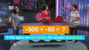
Picture graphs and bar graphs are used to represent data and to solve simple one- and two-step problems using the information in the graphs. On scaled pictographs, a picture represents more than one item on a pictograph. Scaled graphs help us show data where larger numbers are involved.
To better understand scaled picture graphs and bar graphs…
LET’S BREAK IT DOWN!
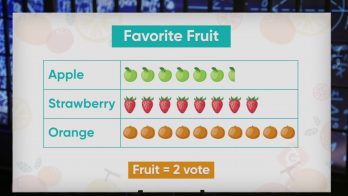
Lunchtime Fruit
Suppose we want to graph the results of Marco's survey of students asking which fruit they want to be served with lunch. Strawberries received 21 votes, oranges received 26 votes, and apples received 12 votes. Using a scale where a picture of 1 piece of fruit is equal to 2 votes allows us to create a graph that represents the votes and is easier to read than if we used 1 piece of fruit for each vote. We can represent the 21 votes for strawberries with 10 pictures of fruit plus 1 half picture of fruit: 10 × 2 = 20, plus one half of two (which equals 1) makes 21! We can use part of a picture to represent a smaller number than the scale. The orange votes are represented with 13 pieces of fruit, since 13 × 2 = 26, and the apple votes with 6 pieces of fruit, since 6 × 2 = 12. We can use this graph to show that the difference between strawberries and oranges is 26 – 21 = 5. Try this one: How many fewer votes did strawberries get than oranges and apples combined?
Counting Bugs

Let's say you would like to create a graph that displays the number of each different type of bug you counted at the bug museum—and the numbers are large! Since you counted 35 ladybugs, 55 butterflies, and 72 ants, a scale that shows 1 bug magnet equal to 5 insects makes more sense than using a scale of 1 magnet for every 2 insects. Your graph will have 7 magnets to represent the 35 ladybugs (7 × 5 = 35), and 11 magnets to represent the 55 butterflies (11 × 5 = 55). To represent the 72 ants, use 14 bug magnets (14 × 5 = 70) plus one-half of a magnet to show the last 2 ants (70 + 2 = 72). If we only want to use this pictograph to make comparisons between the categories by looking at the graph, we do not have to worry about the fact that 2 is actually less than one-half of 5. We can use our pictograph to answer questions like: which category has the most bugs in it? It's the ants! Try this: Which category of bugs has the smallest number of bugs?
Food Drive
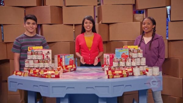
Let's see how a scaled bar graph can help us display the numbers of different food items our friends collected for the food bank. Marcos and April collected 35 cans of soup, 20 cups of fruit, and 48 cartons of milk. In deciding what scale to use for their bar graph they look at the greatest number in their category counts, which is 48 cartons of milk. If they use a scale of 1, or even 2, the bar on the graph would be too long. Instead, they can use a scale of 5 and place tick marks along the vertical side starting at 0, then 5, then 10—labeling each mark—up to 50. Now they can draw a bar up to the mark that represents 20 to show fruit cups and a bar up to 35 to represent the cans of soup. The 48 cartons of milk can be represented by a bar at a height between 45 and 50. Now they can use this graph to solve problems like: about how many cartons of milk are there? The answer is that there are between 45 and 50 cartons of milk but the number is closer to 50 than to 45. Try this: Estimate the total number of items donated to the food bank.
Snack Drawer
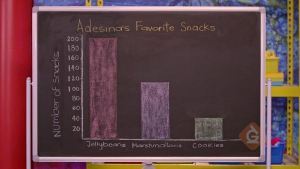
Let's see how to scale a bar graph so that we can represent even larger numbers, like the counts of each type of goody in Adesina's snack drawer. Scaling our bar graph by 10's allows us to create an easy-to-read graph to display Adesina's 200 jellybeans, 110 marshmallows, and 40 cookies. Now the tick marks on the vertical axis are separated by intervals of 10 units. We graph the data by drawing a bar for each snack category that goes up to the height for the snack's count, as represented by the tick mark on the vertical axis at that height. Now we can use the graph to answer questions like: what is the total number of snack items in the drawer? The heights of the bars tell us that 200 + 110 + 40 = 350, so there are 350 in total! Try this: How many more jellybeans are there than marshmallows and cookies combined?


 Select a Google Form


 GENERATION GENIUS