


Histograms are a special kind of bar graph that shows a bar for a range of data values instead of a single value. A box plot is a data display that draws a box over a number line to show the interquartile range of the data. The ‘whiskers’ of a box plot show the least and greatest values in the data set.
To better understand histograms & box plots…
LET’S BREAK IT DOWN!
What are histograms?
If a data set has a lot of different measurements, displaying it using line graphs does not always help to interpret the information. Instead, you can display the data using a type of bar graph called a histogram. In a histogram, bars represent ranges instead of individual values. These bars are called bins, and they are presented continuously with no spaces between them. Each bar represents a range of data points, and the height of the bar tells us how many data points are in that range. Now you try: Find a picture of a histogram online or in your textbook. Identify the bins and the height of each bar.
What can we learn from reading a histogram?
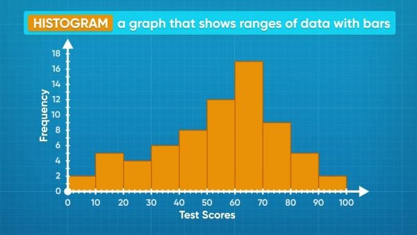
On a test, the students on your class got the following scores: 58, 55, 58, 55, 59, 56, 54, 62, 66, 62, 62, 61, 68, 70, 66, 70, 69, 66, 63, 70, 66, 66, 62, 61, 76, 77, 71, 75, 71, 79, 79, 78, 85, 88, 85, 81, 85, 86, 95, 99, 91, 95. You can separate the data into ranges. Here, it makes sense to choose ranges 50-59, 60-69, 70-79, 80-89, and 90-99. You want to have enough bins to make several distinct ranges, but not so many that they are hard to interpret. If you look at the histogram represented by the data, you can see that the most common grades are in the 60-69% range. The least common grades are in the 90-100% range. Those are called outliers. Now you try: Find a picture of a histogram online or in your textbook. Which bin contained the least number of values? Where there any outliers?
How can we organize our data for a histogram?
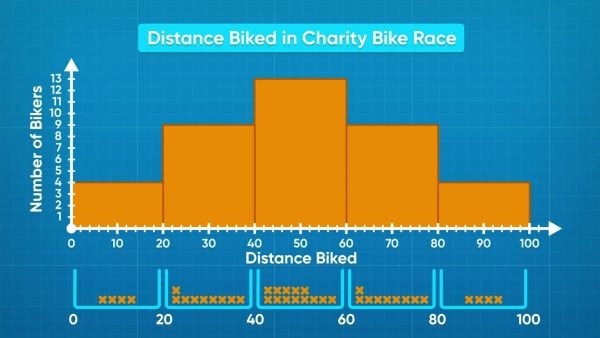
When you have a lot of data, you first have to decide how many bins you would like to use, and what the range of each bin should be. In a bike race, the distances in kilometers that cyclists rode are: 5, 8.25, 15.5, 18, 20, 22.5, 28, 28, 29.5, 30, 30, 36.5, 38, 42.5, 45.75, 46, 47, 48, 48, 50, 50, 52, 55, 58, 58, 59, 63.25, 65.5, 67, 70, 70, 72, 75, 75, 76, 83, 87.75, 94.5, 95. You can organize the data into 5 bins, the first one 0-19, then 20-39, 40-59, 60-79, and 80-99. You can then draw the axes for the graph and label the bin sizes at the bottom along the x-axis, and label it “Distance Biked.” The y-axis can be labeled “Number of Cyclists.” Now as you read the data, you can make a tick to count each time a point contributes to a bin. The 0-19 bin has a frequency of 4, 20-39 has 9, 40-59 has 13, 60-79 has 9, and 80-99 has 4. You can see that the most common distance biked is 40-59 kilometers! If you choose bin size 5, you would have a lot more bars and they would be harder to interpret. If you choose bin size 40, you would only have 3 bars, which is not clear either. It is important to choose a bin size that helps you make sense of the data. Now you try: A data set contains the following data: 12, 18, 19, 5, 17, 10, 3, 2, 24, 1, 22. What size bins would you choose for your histogram?
What are box plots?
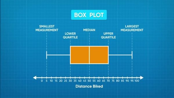
Histograms are great for showing what data ranges are most and least common, but they do not tell details like the range or the median. You can use box plots to present these values. They have 5 vertical lines. The lines farthest on the left and right tell the least and greatest values of the data set. The line in the middle is the median. The other two lines are called the lower quartile and upper quartile. The lower quartile line is on the left of the median, and it tells us that one-quarter of the data points are less than or equal to the lower quartile. The upper quartile is on the right of the median and tells us that one-quarter of the data points are greatest than or equal to the upper quartile. Now you try: Find an image of a box plot online or in your textbook. Identify the 5 key values in the box plot.
How do we make a box plot?
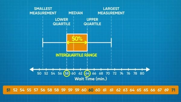
The wait times for a rollercoaster, in minutes, are: 51, 54, 55, 56, 57, 57, 58, 58, 58, 59, 59, 59, 59, 59, 60, 61, 61, 61, 61, 62, 62, 64, 64, 66, 67, 69, 70, 71, 71. To start making the box plot, locate the least and greatest values. Luckily, this data set is already sorted from least to greatest, so you can see that these values are 51 and 71. Place and label these values on the plot. Next, find the median. The number in the middle is 60. That means half of the people waited greater than or equal to 60 minutes, and half the people waited less than or equal to 60 minutes. To find the lower quartile, we find the time that is the middle data point in the range 51 to 60, and to find the upper quartile we find the middle data point in the range 60 to 71. The lower quartile is 58 and the upper quartile is 64. If 25% of people waited 58 minutes or less, and 25% of people waited 64 minutes or more, that means that at least half of the people waited between 58 and 64 minutes. This is called the interquartile range. Now you try: A set of data has a range of 3 to 85. The median is 72. The lower and upper quartiles are 35 and 78. Draw a box plot using this information.


 Select a Google Form


 GENERATION GENIUS