
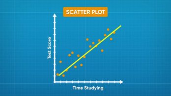


A scatter plot is a graph that shows the relationship between data that has two numeric variables. For example, if you collect data on the relationship between the number of hours a student studies and their score on a test, the data has two numeric variables: time studied and test score. You graph scatter plot values on the coordinate plane.
To better understand displaying bivariate data (scatter plots)…
LET’S BREAK IT DOWN!
Make a scatter plot to show ice cream purchases and daily temperatures.
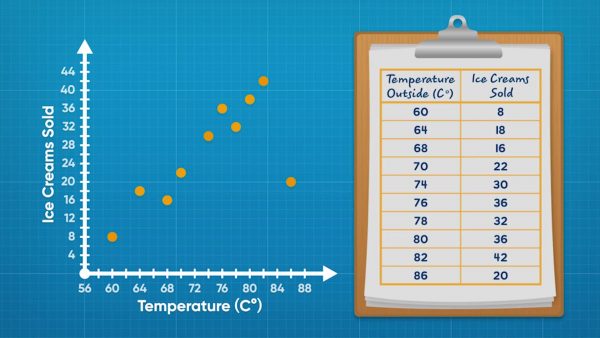
Adesina collected data about ice cream fundraisers. Each piece of data gives the temperature that day and the amount of ice cream sold. This kind of data is called bivariate data because it has 2 variables. Line plots can only show 1 variable. Scatter plots are a tool you can use to display bivariate data. You can make coordinate pairs using the data. For example, one day it was 60 degrees Fahrenheit and 8 ice creams were sold. You can then plot (60, 8) on a coordinate plane. Repeat for all data points and you have a scatter plot. It is called a scatter plot because the data looks scattered. Now you try: One day was 75 degrees Fahrenheit. They sold 49 ice creams. What coordinate pair would you use to represent this data point on the scatter plot?
Identify the relationship between ice cream purchases and daily temperatures.
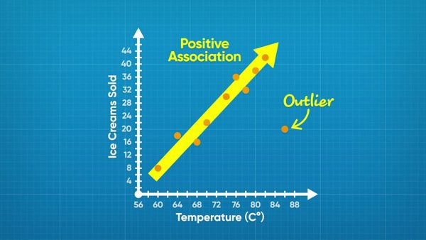
While the ice cream data is scattered, it does show a trend. In general, the higher the temperature, the greater the number of ice creams sold. This is called a positive association because the values are increasing as you move right. One point, (86, 20), does not follow the trend. This point is an outlier. Now you try: A scatter plot shows the relationship between time spent running and distance ran. In general, as time increases, distance also increases. What kind of association is there between the variables?
Identify relationships with negative or no association.
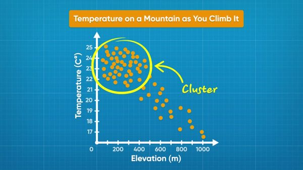
A scatter plot shows temperature and elevation data. Each data point shows the temperature read at a given elevation. Elevation is on the x-axis and temperature is on the y-axis. As the graph goes from left to right, the dots trend downward. As elevation increases, temperature decreases. This plot shows a negative association. Another scatter plot shows the relationship between adult age and adult height. The points are spread out and do not show any trend. This relationship shows no association. Now you try: Draw a scatter plot that shows no association. Draw another scatter plot that shows a negative association.
Find the relationship between study time and test scores.
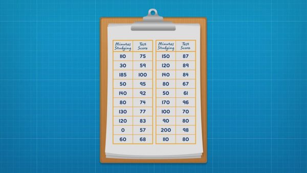
Amari surveyed her class to find out how long they studied for a test and what score they got on the test. She made a coordinate plane that could show test scores from 57% to 100% on the y-axis and study time from 0 to 200 minutes on the x-axis. Then she plotted each data point as (study time, test score). Once all of the data is plotted, she looks for a trend. In general, as study time increases, test scores also increased. There is a positive association between the variables. The trend can be highlighted by drawing a trend line. A trend line is drawn through the middle of the data. A trend line also makes outliers more obvious. The data includes an outlier: one student only studied for 15 minutes and received a score of 95%. Now you try: A company did a survey recording the ages of cyclists and how far they bike each week. How could you label the graph and the axes to represent the data?
Find the relationship between dog weights and food.
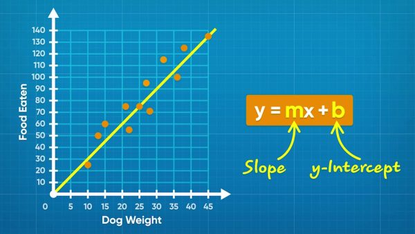
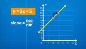
Emily collects data on how much dogs weigh and how much they eat. She plots the data on a scatter plot with "Weight (kg)" on the x-axis and "Food per Day (g)" on the y-axis. She plots each set of data points as coordinate pairs (weight, food). Once all points are plotted, you can see that as dogs get heavier, they eat more food! You can draw a trend line approximately through the middle of the data. You can find the equation of the trend line. Any line can be written in the form y = mx + b, where m is the slope and b is the y-intercept. You could pick two points on the line, such as (25, 75) and (45, 135), to calculate the slope and intercept. The slope is (135 – 75) ÷ (45 – 25) = 3. The y-intercept of Emily's line is 0. So the equation of the line is y = 3x + 0, or y = 3x. Now you try: A trend line passes through the points (0, 15) and (4, 12). What is the equation of the trend line?


 Select a Google Form


 GENERATION GENIUS